The Social Impact of Economic Downturn in NZ
1.Introduction
In recent years, the economic decline in New Zealand has resulted in a persistent rise in joblessness, posing significant difficulties for numerous individuals. This economic situation may negatively impact not only individual well-being but also the well-being of society as a whole. Particularly in the context of the economic downturn, vulnerable groups, especially children and families living in poverty, face challenging situations. This report analyzes how continued unemployment affects individual well-being, with a particular emphasis on the impact of well-being on children, including their health and poverty status. By examining these key factors, we hope to understand better the challenges New Zealand currently faces and explore practical solutions to these problems.
1.1 Dataset sources
- Ministry of Health
- Ministry of Social Development
- OECD
1.2 Research Questions
- Does long-term unemployment affect the health and well-being of individuals?
- How has the long-term unemployment rate impacted various aspects of children’s well-being?
- Does high long-term unemployment exacerbate child poverty?
- How does the economic downturn affect families with children at different poverty lines?
- How does long-term unemployment affect households at varying poverty thresholds over time?
1.3 Executive Summary
1.3.1 Data wrangling
- rename all column names to improve clarity
- select columns from the raw dataset
(1) obtaining the proportion of missing null values in each column
(2) keep columns with less than or equal to 30% null values - set the “year” field as an index
- reformat the data
- deal with outlier
(1) check outlier: plot a box plot and use the descriptive statistic
(2)use a line graph to check for smoothing and to see if there are any outliers
(3)replacement of outliers with NaN - deal with missing values
(1) for this time series dataset, use ‘Linear Interpolation’ to fill in the nulls. Because, the data before and after usually follow the trend with a certain degree of smoothness, and if using the mean or mode to fill in, there is bound to be a jump in the data. Linear interpolation will keep the data smooth
(2) fill of null values at the head and tail of the dataset by using ‘Forward Filling’ and ‘Backward Filling’ - check the result of data wrangling
(1) using descriptive statistics to examine the variability of each variable in the dataset
(2) checking the missing value to see if all null values have been processed
(3) Plotting the histograms to check the smoothness of the time series data
1.3.2 EDA/Data Visulisation
- use a heat map to view the correlation between the variables as a whole
- add new datasets(Anxiety_adult.csv, Anxiety_child.csv, After-hours_care_unmet_need_adult.csv, After-hours_care_unmet_need_child.csv, Unemployment_lt.csv) on health, plot a Scatter Plot Matrix to explore the correlation between the variables
Pose a question for analysis: How has the long-term unemployment rate impacted various aspects of children’s well-being?
1.3.3 Analysis
Examines the impact of the long-term unemployment rate on the quality of children’s diets and access to nutritious food
(1) import data on nutrition
(2) merge DataFrame of long-term unemployment and nutrition
(3) make a scatter plot and Calculate the correlation coefficient to examine the correlation
Result: Long-term unemployment is not significantly related to children’s vegetable intakeAnswer the question: Does high long-term unemployment exacerbate child poverty?
(1) import data on the proportion of children living in poverty
(2) Merge the data frame of long-term unemployment and these three children’s poverty data
(3) plot line graphs to look at the trends of children poverty data and long-term unemployment over the 10-year period, checking if the trends coincide Result:
the relationship between ‘long-term unemployment’ and child poverty exhibits different strengths at different poverty lines
the 40% and 50% poverty lines are lagged relative to the unemployment rate line
(4) checking the lagged correlation
Result:
‘Unemploy_lt’ and the three child poverty rates show a significant positive correlation worsening economy causes more families with children to fall below the poverty lineAnswer the question: How does long-term unemployment affect households at varying poverty thresholds over time? (1) plot a rolling correlation coefficient graph Result: Households with the lowest levels of poverty have little benefited from policy or socioeconomic interventions* OECD
2. Data Wrangling
2.1 View the basics of the raw data set
1
2
3
4
5
6
7
8
9
10
11
12
import pandas as pd
import numpy as np
import seaborn as sns
import matplotlib
import matplotlib.pyplot as plt

#import data
df = pd.read_csv("datasets/shared_prosperity_assignment_dataset_mangled.csv")

#check data info
df.info()
df.head()
1
2
3
4
5
<class 'pandas.core.frame.DataFrame'>
RangeIndex: 37 entries, 0 to 36
Columns: 103 entries, Q5:Q1 to year
dtypes: float64(26), object(77)
memory usage: 29.9+ KB
| Q5:Q1 | D10:D1 | D10:D1-4(Palma) | P90:P10_bhc | P80:P20_bhc | P80:P50_bhc | P50:P20_bhc | GINI-BHC | top_10_perc_wealth_share | top_5_perc_wealth_share | ... | problem_gambling_intervention_prevelance_percent | total_prisoners_in_remand_rate | total_sentenced_prisoners_rate | total_post_sentence_offender_population_rate | violent_crime_victimisations_rate | recorded_murders_and_homicides_per_million | regional_gdp_proportional_variation | difference_in_percent_for_low_income_by_gender | gender_pay_gap | year | |
|---|---|---|---|---|---|---|---|---|---|---|---|---|---|---|---|---|---|---|---|---|---|
| 0 | 5.09 | 8.03 | 1.21 | 3.87 | 2.52 | 1.66 | 0.66 | 32.2 | - | - | ... | NaN | NaN | NaN | NaN | 8.181108 | 17.119505 | NaN | 2.0 | NaN | 1994-12-31 00:00:00 |
| 1 | 4.46 | 6.35 | 1.1 | 3.43 | 2.42 | 1.6 | 0.66 | 30.2 | - | - | ... | NaN | NaN | NaN | NaN | NaN | NaN | NaN | 1.0 | NaN | 1990-12-31 00:00:00 |
| 2 | 5.94 | 9.75 | 1.44 | 4.26 | 2.67 | 1.64 | 0.62 | 35.1 | - | - | ... | 0.002756 | 0.284385 | 0.199166 | 0.213597 | 5.838588 | 8.439685 | 0.445194 | 1.0 | 10.3 | 2011-12-31 00:00:00 |
| 3 | 5.51 | 9.15 | 1.31 | 4.17 | 2.74 | 1.62 | 0.59 | 33.4 | 55.0 | 41.0 | ... | 0.100000 | 0.243818 | 0.202436 | 0.171839 | 6.188446 | 11.498893 | 0.401651 | 0.0 | 12.7 | 2004-12-31 00:00:00 |
| 4 | ??? | ??? | ??? | ??? | ??? | ??? | ??? | ??? | - | - | ... | NaN | NaN | NaN | NaN | NaN | NaN | NaN | NaN | NaN | 1987-12-31 00:00:00 |
5 rows × 103 columns
In our review of the data, we noted the following characteristics:
- The dataset contains a large number of variables, specifically 103 columns.
- The column names consisted of lengthy strings. However, we had the pre-supplied ‘Data documentation.csv’ so we could use the condensed names to replace and check the descriptions of the individual variables. 3.There are a series of invalid entries in the data table, such as ‘???’ , ‘-‘, ‘null’, ‘Null’, ‘nan’ and ‘Nan’.
- The dataset contains a ‘year’ field, which is ideal for use as a unique index.
For the purpose of this analysis, we will perform a detailed data cleaning:
2.2 Start data Wrangling
step1. Rename all column names to improve clarity
In this step, get the variable name mappings of the Data documentation.xlsx file, and modify the variable names in bulk
1
2
3
4
5
6
7
8
9
10
11
12
13
14
15
16
17
18
19
20
21

#Read the data documentation.xlsx file to get the column name correspondences
data_documentation = pd.read_excel('../datasets/Data documentation.xlsx', sheet_name=None)

# Create a dictionary to store the column name correspondences under each category
column_mapping = {}

#Iterate through each sheet and store the column name mappings in the dictionary
for category, df_sheet in data_documentation.items():
    column_mapping[category] = dict(zip(df_sheet['Column name in dataset'], df_sheet['Indicator name (alternative)']))


# Modify the column name
for category, mapping in column_mapping.items():
    for old_column, new_column in mapping.items():
        if old_column in df.columns:
            df.rename(columns={old_column: new_column}, inplace=True)

#View the table header to confirm that the column name change was successful
df.head(0)
| Q5:Q1 income share | D10:D1 income share | D10:D1-4 income share (Palma) | P90:P10 income | P80:P20 income | P80:P50 income | P50:P20 income | GINI | Top 10 percent wealth share | Top 5 percent wealth share | ... | Problem gambling | Remand population | Sentenced population | Post-sentence population | Crime victimisation | Murders and homicides | Regional GDP | Inadequacy of income, region | Gender pay gap | year |
|---|
0 rows × 103 columns
step2. Select the columns
The purpose of this step is to drop those columns that have too many null values. The reason for doing this is that the table only has 37 rows of data, a small sample size, and if there are too many null values, it will affect the accuracy of the data analysis.
The whole process will be carried out in steps:
- Define what a null value is: ‘???’ , ‘-‘, case-insensitive characters ‘null’, ‘nan’
- According to this definition, traversing the data set and finding all null values
- Delete the columns with more null values
1
2
3
4
5
6
7
8
9
10
11
12
13
14
15
16
17
18
19
20
21
22
23
24
25
26
27
28
29
30
31
32
33
34
35
36
37
# Define a null detection function
def is_empty(value):
    if pd.isnull(value) or value == 0:
        return True
    if isinstance(value, str):
        normalized_value = value.strip().lower()
        if normalized_value in ["-", "null", "???"]:
            return True
        if "nan" in normalized_value:
            return True
    return False

#Apply function to DataFrame to identify null values
empty_indicator = df.map(is_empty)

#Replace the null value identified as True with NaN
df_cleaned = df.where(~empty_indicator, other=np.nan)

#Calculate the proportion of null values in each column
empty_proportions = df_cleaned.isnull().mean()

#The number of nulls in each range, grouped at 10 percent intervals.
bins = np.arange(0, 1.1, 0.1)
labels = [f'{int(left*100)}%-{int(right*100)}%' for left, right in zip(bins[:-1], bins[1:])]

proportion_groups = pd.cut(empty_proportions, bins=bins, labels=labels, include_lowest=True)

#Count the number of variables in each interval
group_counts = proportion_groups.value_counts().sort_index()

#Display results
final_results = pd.DataFrame({
    'Empty Proportion Range': group_counts.index,
    'Variable Count': group_counts.values
})

print(final_results)
1
2
3
4
5
6
7
8
9
10
11
  Empty Proportion Range  Variable Count
0                 0%-10%               1
1                10%-20%               5
2                20%-30%               3
3                30%-40%               3
4                40%-50%              28
5                50%-60%              22
6                60%-70%               4
7                70%-80%              13
8                80%-90%              23
9               90%-100%               1
Based on the results, it was found that columns with more than 40% missing values make up a large portion of the columns. For a dataset of just over 37 rows, take variables with a range of null values less than 30%. This is because filling fewer null fields will reduce the impact of inaccuracy.
1
2
3
4
5
6
7
# Filtering of columns with less than or equal to 30% null values
columns_to_keep = empty_proportions[empty_proportions <= 0.3].index

# Create a new DataFrame containing only the selected columns
df_new = df_cleaned[columns_to_keep]

df_new.head()
| Lower deciles income share | Middle class income share | Home ownership | Unemployment | Unemployment, 60-64 | Unemployment, 65+ | Long-term unemployment | Suicides | year | |
|---|---|---|---|---|---|---|---|---|---|
| 0 | 19.9 | 54.9 | 71.422294 | 8.4 | 3.3 | 2.3 | 32.93502612 | 14.148386 | 1994-12-31 00:00:00 |
| 1 | 21.3 | 59.50000000000001 | NaN | 8.0 | 3.3 | 2.1 | 22.06366623 | 12.972769 | 1990-12-31 00:00:00 |
| 2 | 18.9 | 57.5 | 65.103114 | 6.0 | 2.9 | 1.7 | 8.914450139 | 10.900001 | 2011-12-31 00:00:00 |
| 3 | 19.0 | 54.6 | 67.087263 | 4.0 | 2.5 | NaN | 11.65048555 | 11.740197 | 2004-12-31 00:00:00 |
| 4 | NaN | NaN | NaN | 4.2 | 1.3 | 1.7 | 10.56751469 | 13.571673 | 1987-12-31 00:00:00 |
step3. Set the “year” field as an index
Set the ‘year’ column as the index. Since each row of data in the table is sampled by year, display the index date as year and remove the specific date display. Finally, the data by year should be sorted in ascending order to make it easier to do trend analysis.
1
2
3
4
5
6
7
8
9
10
11
12
13
14
15

df_new = df_new.copy()

# Converting a "year" column to a datetime object
df_new['year'] = pd.to_datetime(df_new['year'])

# Extract the year portion and set it to a string type
df_new['year'] = df_new['year'].dt.year

# Sort the values in the "year" column in ascending order.
df_new = df_new.sort_values(by='year').copy()

df_new.set_index('year', inplace=True)

df_new.head()
| Lower deciles income share | Middle class income share | Home ownership | Unemployment | Unemployment, 60-64 | Unemployment, 65+ | Long-term unemployment | Suicides | |
|---|---|---|---|---|---|---|---|---|
| year | ||||||||
| 1982 | 22.2 | 63.3 | NaN | NaN | NaN | NaN | NaN | NaN |
| 1983 | NaN | NaN | NaN | NaN | NaN | NaN | NaN | NaN |
| 1984 | 22.3 | 62.50000000000001 | NaN | NaN | NaN | NaN | NaN | NaN |
| 1985 | NaN | NaN | NaN | NaN | NaN | NaN | NaN | 9.995119 |
| 1986 | 22.8 | 64.6 | NaN | 4.2 | 1.3 | 2.0 | 7.93319426 | 12.297609 |
step4. Reformat data
Check the format of the fields in the dataset and convert all the data formats to float.
This is because the data will be processed with calculations in the following analysis.
In addition, in order to increase the readability of the data, adjust the number of decimal places of the data to 2.
1
df_new.dtypes
1
2
3
4
5
6
7
8
9
Lower deciles income share     object
Middle class income share      object
Home ownership                float64
Unemployment                   object
Unemployment, 60-64           float64
Unemployment, 65+              object
Long-term unemployment         object
Suicides                      float64
dtype: object
1
2
3
4
5
6
df_new = df_new.astype(float).round(1)

# Setting Pandas floating-point display precision to 2 decimal place
pd.set_option('display.precision', 2)

df_new.head()
| Lower deciles income share | Middle class income share | Home ownership | Unemployment | Unemployment, 60-64 | Unemployment, 65+ | Long-term unemployment | Suicides | |
|---|---|---|---|---|---|---|---|---|
| year | ||||||||
| 1982 | 22.2 | 63.3 | NaN | NaN | NaN | NaN | NaN | NaN |
| 1983 | NaN | NaN | NaN | NaN | NaN | NaN | NaN | NaN |
| 1984 | 22.3 | 62.5 | NaN | NaN | NaN | NaN | NaN | NaN |
| 1985 | NaN | NaN | NaN | NaN | NaN | NaN | NaN | 10.0 |
| 1986 | 22.8 | 64.6 | NaN | 4.2 | 1.3 | 2.0 | 7.9 | 12.3 |
step5. Deal with outliers
The purpose of this step is to check for outliers in the data set for each variable
For all of the eight columns of data in the dataset, make a box plot
1
2
3
4
5
6
7
8
9
10
11
12
13
14
15
# Setting the canvas size
plt.figure(figsize=(16, 8))

#Plot a box plot for each variable
for i, column in enumerate(df_new.columns, 1):
    plt.subplot(2, 4, i)
    sns.boxplot(y=df_new[column])
    plt.title(column)
    plt.yticks([])
    plt.ylabel('')


plt.tight_layout(pad=3.0)
plt.show()
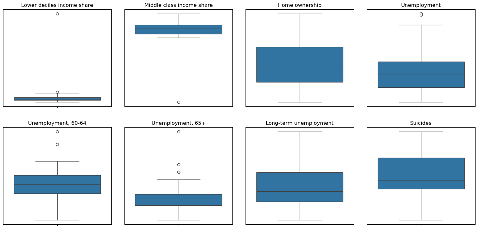
For the variables ‘Lower deciles income share’ and ‘Middle class income share’, the outliers are more significant and the outliers are directly removed in the next processing.
For the variables ‘Unemployment’, ‘Unemployment, 60-64’, ‘Unemployment, 65+’, descriptive statistics are viewed to make a determination.
1
df_new.describe()
| Lower deciles income share | Middle class income share | Home ownership | Unemployment | Unemployment, 60-64 | Unemployment, 65+ | Long-term unemployment | Suicides | |
|---|---|---|---|---|---|---|---|---|
| count | 27.00 | 27.00 | 26.00 | 32.00 | 32.00 | 30.00 | 32.00 | 33.00 |
| mean | 21.46 | 56.71 | 67.58 | 6.09 | 2.92 | 1.67 | 16.04 | 12.65 |
| std | 6.53 | 7.43 | 2.85 | 1.87 | 0.91 | 0.49 | 7.78 | 1.28 |
| min | 18.90 | 22.90 | 63.20 | 3.60 | 1.20 | 1.00 | 4.30 | 10.00 |
| 25% | 19.60 | 55.05 | 65.48 | 4.78 | 2.45 | 1.40 | 10.40 | 11.80 |
| 50% | 19.90 | 57.60 | 67.20 | 5.80 | 2.90 | 1.60 | 13.85 | 12.30 |
| 75% | 20.75 | 59.30 | 69.47 | 6.85 | 3.32 | 1.70 | 20.20 | 13.60 |
| max | 53.60 | 64.60 | 73.30 | 10.70 | 5.40 | 3.40 | 33.80 | 15.10 |
From the mean values and the gap of the third quartile (75%) and maximum value in the table above, it can be seen that the extreme values are not as pronounced as those of the first two variables.
Therefore, these three variables are not labelled as outliers for now. This is because, given the dataset, with only a sample size of 30+ under each variable, some caution is needed for screening outliers and keeping as many values as possible for analysis.
On the other hand, the dataset is time series data, and it is expected that the data should have some smoothing, so plotting line plots for these three variables (‘Unemployment’, ‘Unemployment, 60-64’, ‘Unemployment, 65+’) to check for smoothing and to see if there are any outliers.
1
2
3
4
5
6
7
8
9
10
11
12
13
14
15
16
17
18
19
20
21
22
23
import matplotlib.pyplot as plt
import matplotlib.ticker as ticker


columns = ['Unemployment', 'Unemployment, 60-64', 'Unemployment, 65+']

#Setting the graph size
plt.figure(figsize=(20, 6))

#Plotting a bar graph for each variable
for i, column in enumerate(columns):
    ax = plt.subplot(1, 3, i + 1)
    plt.bar(df_new.index.astype(str), df_new[column], alpha=0.6)
    plt.title(column)
    plt.xlabel('Year')
    plt.ylabel('Value')

    # Set the x-axis scale interval to display every 5 years
    ax.xaxis.set_major_locator(ticker.MultipleLocator(5))

# Adjustment of the layout and display the plots
plt.tight_layout()
plt.show()
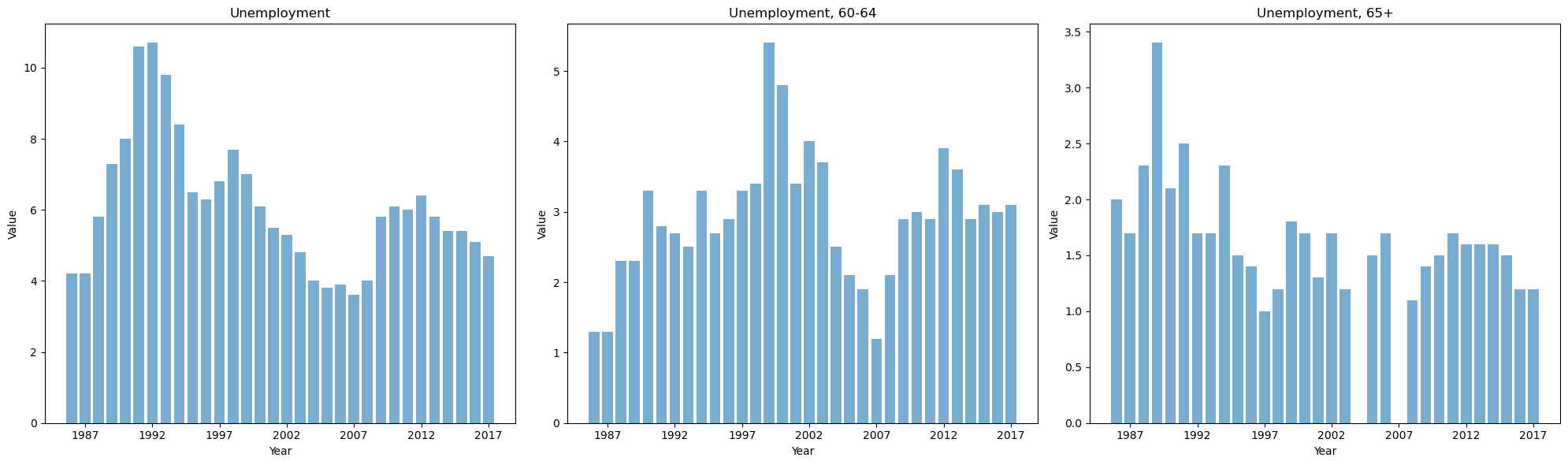
From the above graph, we see that for the variable ‘Unemployment’, although the data for 1991 and 1992 are extremely high, they are smooth and continuous in terms of trend, so the outliers for the variable ‘Unemployment’ are not dealt with.
For the variable ‘Unemployment,60-64’, the two values that are extremely large deviate from the trend more, so these two outliers need to be dealt with. It was also found that the data for the year 2007 deviated more from the trend, but it was not observed in the box plot, so this year needs to be treated as an outlier at the same time. For the variable ‘Unemployment,65+’, the extremely large value deviates more from the trend and hence this outlier is treated.
To summarise, the variables that need to be treated as outliers in this data are:
- the variables ‘Lower deciles income share’ and ‘Middle class income share’
- the variable ‘Unemployment, 60-64’, plus 2007 data
- the variable ‘Unemployment,65+’
The processing of is that replacing the outlier with a null valuent,65+’
1
2
3
4
5
6
7
8
9
10
11
12
13
14
15
16
17
18
19
20
21
22
23
24
25
26
27
#deal with the outliers

#select the columns to for process
columns_to_process = [
    'Lower deciles income share',
    'Middle class income share',
    'Unemployment, 60-64',
    'Unemployment, 65+'
]

#Iterate through the column names and process each column
for column in columns_to_process:
    # Calculating IQR
    Q1 = df_new[column].quantile(0.25)
    Q3 = df_new[column].quantile(0.75)
    IQR = Q3 - Q1

    # Defining outlier ranges
    lower_bound = Q1 - 1.5 * IQR
    upper_bound = Q3 + 1.5 * IQR

    #Replacement of outliers with NaN
    df_new.loc[(df_new[column] < lower_bound) | (df_new[column] > upper_bound), column] = np.nan

# Processing of 2007 data for unemloyment 60-64
df_new.loc[2007, 'Unemployment, 60-64'] = pd.NA
1
2
3
# Checking the missing value
print(df_new.isnull().sum())
df_new.head()
1
2
3
4
5
6
7
8
9
Lower deciles income share    12
Middle class income share     11
Home ownership                11
Unemployment                   5
Unemployment, 60-64            8
Unemployment, 65+             11
Long-term unemployment         5
Suicides                       4
dtype: int64
| Lower deciles income share | Middle class income share | Home ownership | Unemployment | Unemployment, 60-64 | Unemployment, 65+ | Long-term unemployment | Suicides | |
|---|---|---|---|---|---|---|---|---|
| year | ||||||||
| 1982 | 22.2 | 63.3 | NaN | NaN | NaN | NaN | NaN | NaN |
| 1983 | NaN | NaN | NaN | NaN | NaN | NaN | NaN | NaN |
| 1984 | 22.3 | 62.5 | NaN | NaN | NaN | NaN | NaN | NaN |
| 1985 | NaN | NaN | NaN | NaN | NaN | NaN | NaN | 10.0 |
| 1986 | NaN | 64.6 | NaN | 4.2 | 1.3 | 2.0 | 7.9 | 12.3 |
step6. Deal with missing values
Outliers in the dataset have been replaced with null values.
‘Linear Interpolation’ will be used to fill in the nulls. This is because, with time series data, the data before and after usually follow the trend with a certain degree of smoothness, and if you use the mean or mode to fill in, there is bound to be a jump in the data. Linear interpolation will keep the data smooth.
At the same time, it can be noted that in the first two rows of the data table and the last two rows, there are null values, so it can not be filled by linear interpolation. Therefore, it is necessary to complete the filling of null values at the head and tail of the dataset by using ‘Forward Filling’ and ‘Backward Filling’ again.
1
2
3
4
5
6
7
8
#Linear Interpolation
df_new.interpolate(method='linear', inplace=True)

#Forward Filling
df_new.ffill(inplace=True)

#Backward Filling
df_new.bfill(inplace=True)
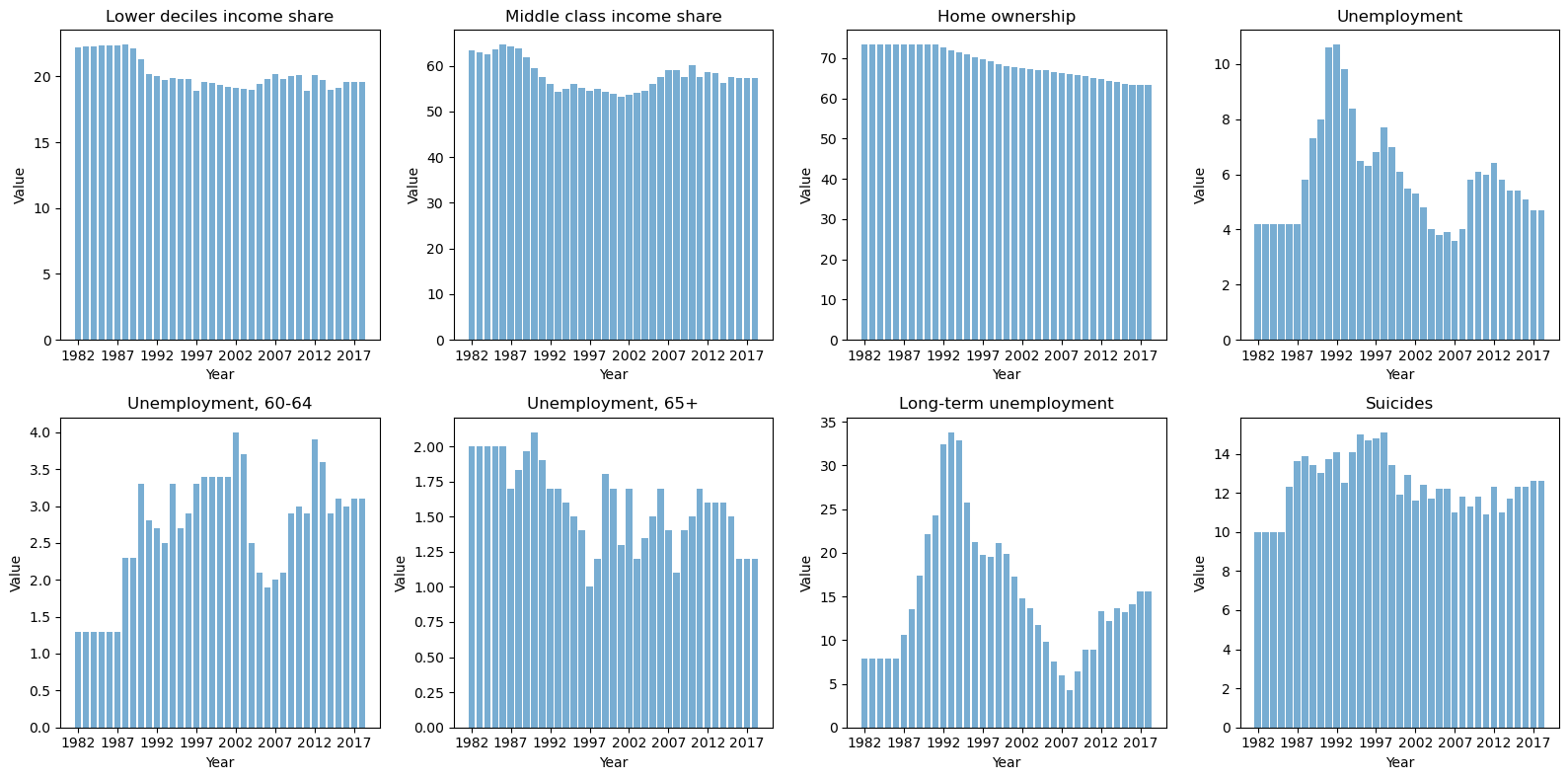
2.3 Checking the results of data wraggling
Finally, the results of the DATA WRAGGLING need to be tested.
- Use descriptive statistics to examine the variability of each variable in the dataset
- Check the missing value to see if all null values have been processed
- Plot the histograms to check the smoothness of the time series data
1
2
3
4
5
6
7
8
9
10
11
12
13
14
15
16
17
18
19
20
21
22
23
24
25
26
27
28
29
#Descriptive statistics
print("Descriptive statistics:")
print(df_new.describe().T)


#Missing value checking
print("\n The number of missing values:")
print(df_new.isnull().sum())
print()

#Setting the Chart Size
plt.figure(figsize=(16, 8))

#Get all column names of df_new
columns = df_new.columns

#Iterate over all columns and plot a bar chart for each column
for i, column in enumerate(columns):
    ax = plt.subplot(2, 4, i + 1)
    plt.bar(df_new.index.astype(str), df_new[column], alpha=0.6)
    plt.title(column)
    plt.xlabel('Year')
    plt.ylabel('Value')

    #Set the x-axis scale interval to display every 5 years
    ax.xaxis.set_major_locator(ticker.MultipleLocator(5))

plt.tight_layout()
plt.show()
1
2
3
4
5
6
7
8
9
10
11
12
13
14
15
16
17
18
19
20
21
Descriptive statistics:
                            count   mean   std   min   25%   50%   75%   max
Lower deciles income share   37.0  20.21  1.20  18.9  19.4  19.8  20.2  22.4
Middle class income share    37.0  57.92  3.38  53.2  54.9  57.5  59.5  64.6
Home ownership               37.0  68.74  3.68  63.2  65.7  67.9  73.3  73.3
Unemployment                 37.0   5.85  1.85   3.6   4.2   5.5   6.5  10.7
Unemployment, 60-64          37.0   2.68  0.80   1.3   2.1   2.9   3.3   4.0
Unemployment, 65+            37.0   1.59  0.30   1.0   1.4   1.6   1.8   2.1
Long-term unemployment       37.0  15.15  7.66   4.3   8.9  13.6  19.7  33.8
Suicides                     37.0  12.44  1.41  10.0  11.7  12.3  13.4  15.1

 The number of missing values:
Lower deciles income share    0
Middle class income share     0
Home ownership                0
Unemployment                  0
Unemployment, 60-64           0
Unemployment, 65+             0
Long-term unemployment        0
Suicides                      0
dtype: int64
3.EDA/Data Visulisation
1
df_new.head()
| Lower deciles income share | Middle class income share | Home ownership | Unemployment | Unemployment, 60-64 | Unemployment, 65+ | Long-term unemployment | Suicides | |
|---|---|---|---|---|---|---|---|---|
| year | ||||||||
| 1982 | 22.20 | 63.30 | 73.3 | 4.2 | 1.3 | 2.0 | 7.9 | 10.0 |
| 1983 | 22.25 | 62.90 | 73.3 | 4.2 | 1.3 | 2.0 | 7.9 | 10.0 |
| 1984 | 22.30 | 62.50 | 73.3 | 4.2 | 1.3 | 2.0 | 7.9 | 10.0 |
| 1985 | 22.32 | 63.55 | 73.3 | 4.2 | 1.3 | 2.0 | 7.9 | 10.0 |
| 1986 | 22.35 | 64.60 | 73.3 | 4.2 | 1.3 | 2.0 | 7.9 | 12.3 |
For the current dataset, explore to see the correlation between them.
There are eight variables in total, which would be enormous if the Scatter Plot Matrix were used. Therefore, using a heat map to view the correlation between the variables is better.
1
2
3
4
5
6
7
8
9
10
11
12
13
#Calculate the correlation coefficient matrix
corr_matrix = df_new.corr()

#Plotting heat maps and setting the font size of colour-coded labels
plt.figure(figsize=(8, 6))
ax = sns.heatmap(corr_matrix, annot=True, fmt=".1f", cmap='coolwarm',
                 cbar_kws={'label': '', 'shrink': 0.5, 'ticks': [-1, -0.5, 0, 0.5, 1], 'format': '%.1f'})

#Setting the size of the colour coded labels
cbar = ax.collections[0].colorbar
cbar.ax.tick_params(labelsize=10)

plt.show()
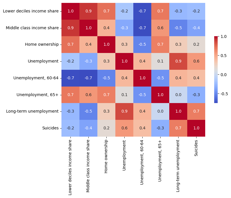
A selected set of variables from the dataset, “Long Term Unemployment Rate” and “Suicide Rate,” showed a significant positive correlation with a correlation coefficient of 0.7. This suggests that there is an essential relationship between them.
It can be assumed that high levels of long-term unemployment may indicate a declining economy. Such periods tend to cause a decrease in people’s well-being, which in turn may lead to higher suicide rates. This link emphasises the potential social impact of economic conditions on mental health or well-being.
To further explore the impact on people’s well-being and health during the recession, several additional health datasets were added to complement the insights.
for the mental health data indicator, select the data on the rates of anxiety disorders for adults and children. Percentage of adults (15+) who have ever been diagnosed with anxiety. Percentage of adults (0-14) who have ever been diagnosed with anxiety. (Source: Ministry of Health)
indicators of inability to access health care for cost reasons Percentage of children (0-14) with an after-hours medical problem who did not visit an after-hours medical centre due to cost in the past 12 months. Percentage of children (15+) with an after-hours medical problem who did not visit an after-hours medical centre due to cost in the past 12 months. (Source: Ministry of Health)
update the data on long-term unemployment (Source: OECD)
1
2
3
4
5
6
#import the data of anxiety disorders for adults and children
df_anxiety_a = pd.read_csv("data_collect/anxiety_adult.csv")
df_anxiety_c = pd.read_csv("data_collect/anxiety_child.csv")

print(df_anxiety_a)
print(df_anxiety_c)
1
2
3
4
5
6
7
8
9
10
11
12
13
14
15
16
17
18
19
20
21
22
23
24
    year  Anxiety_adult
0   2011            6.1
1   2012            6.4
2   2013            8.4
3   2014            7.8
4   2015            9.5
5   2016           10.3
6   2017           11.1
7   2018           11.3
8   2019           11.3
9   2020           12.4
10  2021           14.0
    year  Anxiety_child
0   2011            2.1
1   2012            2.0
2   2013            2.8
3   2014            2.6
4   2015            2.7
5   2016            3.1
6   2017            3.9
7   2018            3.7
8   2019            3.9
9   2020            3.7
10  2021            4.1
1
2
3
4
5
6
#import the data of indicators of inability to access health care for cost reasons
df_unmet_a = pd.read_csv("data_collect/After-hours_care_unmet_need_adult.csv")
df_unmet_c = pd.read_csv("data_collect/After-hours_care_unmet_need_child.csv")

print(df_unmet_a)
print(df_unmet_c)
1
2
3
4
5
6
7
8
9
10
11
12
13
14
15
16
17
18
19
20
21
22
   year  Unmet_adult
0  2011          6.8
1  2012          7.3
2  2013          7.0
3  2014          5.9
4  2015          7.0
5  2016          6.6
6  2017          6.9
7  2018          6.0
8  2019          6.2
9  2020          5.0
   year  Unmet_child
0  2011          4.5
1  2012          4.3
2  2013          3.9
3  2014          3.3
4  2015          4.0
5  2016          2.7
6  2017          2.5
7  2018          2.0
8  2019          1.6
9  2020          1.1
1
2
3
#import the data of updated long-term unemployment
df_unemployment = pd.read_csv("data_collect/unemployment_lt.csv")
print(df_unemployment)
1
2
3
4
5
6
7
8
9
10
11
12
13
14
    year  Unemploy_lt
0   2010          8.9
1   2011          8.9
2   2012         13.3
3   2013         12.2
4   2014         13.8
5   2015         13.8
6   2016         14.0
7   2017         15.6
8   2018         13.5
9   2019         12.7
10  2020          8.8
11  2021         11.2
12  2022         11.6
The next step is to merge the several datasets that have just been imported, and then explore to see if the long-term unemployment rate will have some correlation with these health indicators.
1
2
3
4
5
6
7
8
9
10
11
from functools import reduce

#Create a list dataframes which contains all the DataFrames to be combined
dataframes = [df_unemployment, df_anxiety_a, df_anxiety_c, df_unmet_a, df_unmet_c]

# Use the reduce function to merge all DataFrames, based on the 'year' field, and set 'year' as the index
df_merged = reduce(lambda left, right: pd.merge(left, right, on='year', how='inner'), dataframes).set_index('year')

df_merged
| Unemploy_lt | Anxiety_adult | Anxiety_child | Unmet_adult | Unmet_child | |
|---|---|---|---|---|---|
| year | |||||
| 2011 | 8.9 | 6.1 | 2.1 | 6.8 | 4.5 |
| 2012 | 13.3 | 6.4 | 2.0 | 7.3 | 4.3 |
| 2013 | 12.2 | 8.4 | 2.8 | 7.0 | 3.9 |
| 2014 | 13.8 | 7.8 | 2.6 | 5.9 | 3.3 |
| 2015 | 13.8 | 9.5 | 2.7 | 7.0 | 4.0 |
| 2016 | 14.0 | 10.3 | 3.1 | 6.6 | 2.7 |
| 2017 | 15.6 | 11.1 | 3.9 | 6.9 | 2.5 |
| 2018 | 13.5 | 11.3 | 3.7 | 6.0 | 2.0 |
| 2019 | 12.7 | 11.3 | 3.9 | 6.2 | 1.6 |
| 2020 | 8.8 | 12.4 | 3.7 | 5.0 | 1.1 |
Explore the correlations between the variables in this merged dataset for this merged dataset. Look at the correlation between the long-term unemployment rate and several health indicators.
Plot a Scatter Plot Matrix to visualise the relationship between each pair of indicators. Meanwhile, calculate the correlation coefficients between the variables.
1
2
3
4
5
6
7
8
9
10
11
12
13
14
15
16
17
#Plot a Scatter Plot Matrix
pairplot = sns.pairplot(df_merged,height=1.7, aspect=1)

for ax in pairplot.axes.flatten():
    # Hide x- and y-axis scale labels
    ax.set_xticks([])
    ax.set_yticks([])

    #set font size
    ax.set_xlabel(ax.get_xlabel(), fontsize=10)
    ax.set_ylabel(ax.get_ylabel(), fontsize=10)

plt.show()

#calculate the correlation coefficients between the variables
corr_matrix = df_merged.corr()
corr_matrix
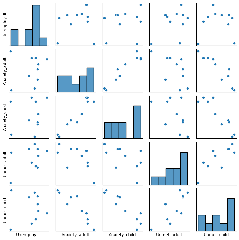
| Unemploy_lt | Anxiety_adult | Anxiety_child | Unmet_adult | Unmet_child | |
|---|---|---|---|---|---|
| Unemploy_lt | 1.00 | 0.13 | 0.19 | 0.42 | 0.04 |
| Anxiety_adult | 0.13 | 1.00 | 0.95 | -0.59 | -0.91 |
| Anxiety_child | 0.19 | 0.95 | 1.00 | -0.52 | -0.91 |
| Unmet_adult | 0.42 | -0.59 | -0.52 | 1.00 | 0.78 |
| Unmet_child | 0.04 | -0.91 | -0.91 | 0.78 | 1.00 |
As can be seen from the data in the graph and the table, there is a correlation between the “Proportion of adults unable to seek medical treatment due to costs” and “Long-term unemployment”. However, the impact on children’s access to health care was minor. Such differences may indicate that, in times of financial constraints, families may prioritise children’s healthcare needs, thereby reducing healthcare expenditures on adults to safeguard the health of their younger children. It is also possible that targeted social policies or benefits may shelter children’s healthcare needs from the adverse effects of economic downturns, ensuring they have access to the healthcare services they need.
On the other hand, it can be seen that child anxiety rate has a robust positive correlation (0.95) with adult anxiety rate, indicating that higher anxiety levels in adults are associated with higher anxiety levels in children. This may indicate family-level influences, whereby children’s emotional states are closely related to those of adults.
Based on the insights from above, there is a need to explore further ‘how the recession has impacted various aspects of children’s well-being’.
4.Analysis
This section will dive into how the economic downturn has affected various aspects of children’s well-being. After exploring issues related to children’s access to health care and mental health, the following probe will expand into two other key areas:
Nutrition: Examine the impact of the recession on the quality of children’s diets and access to nutritious food, which is critical to children’s growth and development.
Poverty: Focus on whether high long-term unemployment exacerbates child poverty?
4.1 Impact on Children Nutrition
Using long-term unemployment to indicate economic recession, we will explore its correlation with children’s daily dietary nutrition. Use the “3+ servings of vegetables per day” dataset (Source: Department of Health)
1
2
3
4
#import the data of eating 3+ servings of vegetables a day
df_nutri = pd.read_csv("data_collect/3+ vegetables a day.csv")

df_nutri
| year | 3+ vegetables a day | |
|---|---|---|
| 0 | 2011 | 51.0 |
| 1 | 2012 | 50.3 |
| 2 | 2013 | 48.3 |
| 3 | 2014 | 49.1 |
| 4 | 2015 | 42.5 |
| 5 | 2016 | 44.3 |
| 6 | 2017 | 44.2 |
| 7 | 2018 | 38.0 |
| 8 | 2019 | 38.2 |
| 9 | 2020 | 34.5 |
1
2
3
4
5
6
7
#Merge DataFrame 'df_unemployment' and 'df_nutri'
df_merged_nutri = pd.merge(df_unemployment, df_nutri, on='year', how='inner')

#Setting 'year' as an index
df_merged_nutri.set_index('year', inplace=True)

df_merged_nutri
| Unemploy_lt | 3+ vegetables a day | |
|---|---|---|
| year | ||
| 2011 | 8.9 | 51.0 |
| 2012 | 13.3 | 50.3 |
| 2013 | 12.2 | 48.3 |
| 2014 | 13.8 | 49.1 |
| 2015 | 13.8 | 42.5 |
| 2016 | 14.0 | 44.3 |
| 2017 | 15.6 | 44.2 |
| 2018 | 13.5 | 38.0 |
| 2019 | 12.7 | 38.2 |
| 2020 | 8.8 | 34.5 |
1
2
3
4
5
6
plt.scatter(df_merged_nutri['Unemploy_lt'], df_merged_nutri['3+ vegetables a day'])
plt.xlabel('Unemploy_lt')
plt.ylabel('3+ vegetables a day')
plt.show()
corr_matrix = df_merged_nutri.corr()
corr_matrix
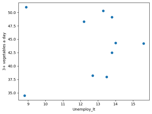
| Unemploy_lt | 3+ vegetables a day | |
|---|---|---|
| Unemploy_lt | 1.00 | 0.11 |
| 3+ vegetables a day | 0.11 | 1.00 |
The data show that the correlation coefficient between “long-term unemployment” and “three or more servings of vegetables per day” is 0.11. This relatively low positive value suggests a weak correlation between these two variables.
This means that it is impossible to conclude definitively from this data set that the recession has significantly reduced children’s vegetable intake.
However, this does not mean that the recession did not impact children’s diets, and other factors or more data may need to be considered to make a full assessment. In addition, the low value of the correlation does not exclude a non-linear relationship or other complex ways in which the recession affected children’s diets.
4.2 Impact on children poverty
Another question that needs to be explored is whether the recession has led to increased numbers of children falling into poverty. Such an analysis would serve as a benchmark for assessing the overall well-being of the child population.
Select data on the proportion of children living in poverty to measure what percentage of children in all households are living in such low-income households, with three specific indicators:
Child poverty as family household income below 40% of anchored line median
Child poverty as family household income below 50% of anchored line median
Child poverty as family household income below 60% of anchored line median
1
2
3
4
#import data on Poverty, 40% AL, child
df_Poverty_40 = pd.read_csv("data_collect/Poverty, 40% AL, child.csv")

df_Poverty_40
| year | Poverty, 40% AL, child | |
|---|---|---|
| 0 | 2011 | 16.1 |
| 1 | 2012 | 16.3 |
| 2 | 2013 | 15.6 |
| 3 | 2014 | 15.8 |
| 4 | 2015 | 15.5 |
| 5 | 2016 | 16.2 |
| 6 | 2017 | 16.1 |
| 7 | 2018 | 15.7 |
| 8 | 2019 | 13.8 |
| 9 | 2020 | 14.0 |
1
2
3
4
#import data on Poverty, 50% AL, child
df_Poverty_50 = pd.read_csv("data_collect/Poverty, 50% AL, child.csv")

df_Poverty_50
| year | Poverty, 50% AL, child | |
|---|---|---|
| 0 | 2011 | 21.9 |
| 1 | 2012 | 22.2 |
| 2 | 2013 | 21.9 |
| 3 | 2014 | 23.0 |
| 4 | 2015 | 23.8 |
| 5 | 2016 | 22.3 |
| 6 | 2017 | 21.4 |
| 7 | 2018 | 22.8 |
| 8 | 2019 | 20.1 |
| 9 | 2020 | 20.1 |
1
2
3
4
#import data on Poverty, 60% AL, child
df_Poverty_60 = pd.read_csv("data_collect/Poverty, 60% AL, child.csv")

df_Poverty_60
| year | Poverty, 60% AL, child | |
|---|---|---|
| 0 | 2011 | 30.2 |
| 1 | 2012 | 28.9 |
| 2 | 2013 | 29.3 |
| 3 | 2014 | 29.3 |
| 4 | 2015 | 30.5 |
| 5 | 2016 | 29.8 |
| 6 | 2017 | 28.4 |
| 7 | 2018 | 30.6 |
| 8 | 2019 | 27.7 |
| 9 | 2020 | 27.9 |
1
2
3
4
5
6
7
#Create a list dataframes which contains all the DataFrames to be combined
dataframes = [df_unemployment, df_Poverty_40, df_Poverty_50, df_Poverty_60]

# Use the reduce function to merge all DataFrames, based on the 'year' field, and set 'year' as the index
df_poverty = reduce(lambda left, right: pd.merge(left, right, on='year', how='inner'), dataframes).set_index('year')

df_poverty
| Unemploy_lt | Poverty, 40% AL, child | Poverty, 50% AL, child | Poverty, 60% AL, child | |
|---|---|---|---|---|
| year | ||||
| 2011 | 8.9 | 16.1 | 21.9 | 30.2 |
| 2012 | 13.3 | 16.3 | 22.2 | 28.9 |
| 2013 | 12.2 | 15.6 | 21.9 | 29.3 |
| 2014 | 13.8 | 15.8 | 23.0 | 29.3 |
| 2015 | 13.8 | 15.5 | 23.8 | 30.5 |
| 2016 | 14.0 | 16.2 | 22.3 | 29.8 |
| 2017 | 15.6 | 16.1 | 21.4 | 28.4 |
| 2018 | 13.5 | 15.7 | 22.8 | 30.6 |
| 2019 | 12.7 | 13.8 | 20.1 | 27.7 |
| 2020 | 8.8 | 14.0 | 20.1 | 27.9 |
In the dataset are time series data presenting trends in the percentage of children living in poverty over ten years from 2011 to 2020, given changes in the economic environment.
Line graphs allow us to examine these variables’ trends over the past ten years and see if they coincide.
Since the “long-term unemployment rate” and the other three poverty indicators run on different scales, using two y-axes in the line graph allows for a clear display of values. The left y-axis can represent the long-term unemployment rate, and the right y-axis can represent the child poverty rate.
1
2
3
4
5
6
7
8
9
10
11
12
13
14
15
16
17
18
19
20
21
22
23
24
25
26
27
28
29
30
31
32

fig, ax1 = plt.subplots(figsize=(8, 5))

#Plotting the long-term unemployment rate
ax1.set_xlabel('Year')
ax1.set_ylabel('Unemployment', color='tab:blue')
ax1.plot(df_poverty.index, df_poverty['Unemploy_lt'], color='tab:blue', marker='o', linestyle='-', label='Unemployment')
ax1.tick_params(axis='y', labelcolor='tab:blue')
ax1.set_ylim(5, 17)

#Plotting child poverty rates
ax2 = ax1.twinx()
ax2.set_ylabel('Poverty Rate', color='tab:gray')
ax2.plot(df_poverty.index, df_poverty['Poverty, 40% AL, child'], color='tab:gray', marker='o', linestyle=':', label='40% Poverty')
ax2.plot(df_poverty.index, df_poverty['Poverty, 50% AL, child'], color='tab:gray', marker='x', linestyle=':', label='50% Poverty')
ax2.plot(df_poverty.index, df_poverty['Poverty, 60% AL, child'], color='tab:gray', marker='+', linestyle=':', label='60% Poverty')
ax2.tick_params(axis='y', labelcolor='tab:gray')

#Setup Chart Legend
fig.tight_layout()
ax1.legend(loc="upper left")
ax2.legend(loc="upper right")

ax1.legend(loc='upper left', bbox_to_anchor=(1.1, 0.8), borderaxespad=0.)
ax2.legend(loc='upper right', bbox_to_anchor=(1.31, 1), borderaxespad=0.)

plt.show()

#Calculate the correlation coefficient
correlation_matrix_adjusted = df_poverty.corr()
correlation_matrix_adjusted
| Unemploy_lt | Poverty, 40% AL, child | Poverty, 50% AL, child | Poverty, 60% AL, child | |
|---|---|---|---|---|
| Unemploy_lt | 1.00 | 0.41 | 0.44 | 0.11 |
| Poverty, 40% AL, child | 0.41 | 1.00 | 0.68 | 0.62 |
| Poverty, 50% AL, child | 0.44 | 0.68 | 1.00 | 0.85 |
| Poverty, 60% AL, child | 0.11 | 0.62 | 0.85 | 1.00 |
It can be seen from the data: ‘Long-term unemployment’ has a moderate positive correlation(0.41)with ‘Poverty, 40% AL, child’. There is a moderate positive correlation between the ‘long-term unemployment’ rate and ‘Poverty, 50% AL, child’ (0.44). However, the correlation between the ‘long-term unemployment’ rate and ‘Poverty, 60% AL, child’ is weak (0.11).
This implies that the relationship between ‘long-term unemployment’ and child poverty exhibits different strengths at different poverty lines.
Also, the figure shows that the 40% and 50% poverty lines are lagged relative to the unemployment rate line, so checking their lagged correlation is necessary.
1
2
3
4
5
6
7
8
9
10
11
12
13
14
from scipy.stats import pearsonr
# As seen in the graph, the curve is lagged by 1 year, setting the lag time
lag_year = 1

#Calculate and display the correlation coefficient
print('1-year lagged correlation coefficients:')
corr_coefficient_40 = pearsonr(df_poverty['Unemploy_lt'].iloc[lag_year:], df_poverty['Poverty, 40% AL, child'].iloc[:-lag_year])[0]
print(f"Between 'Unemploy_lt' and 'Poverty, 40% AL, child': {corr_coefficient_40:.2f}")

corr_coefficient_50 = pearsonr(df_poverty['Unemploy_lt'].iloc[lag_year:], df_poverty['Poverty, 50% AL, child'].iloc[:-lag_year])[0]
print(f"Between 'Unemploy_lt' and 'Poverty, 50% AL, child': {corr_coefficient_50:.2f}")

corr_coefficient_60 = pearsonr(df_poverty['Unemploy_lt'].iloc[lag_year:], df_poverty['Poverty, 60% AL, child'].iloc[:-lag_year])[0]
print(f"Between 'Unemploy_lt' and 'Poverty, 60% AL, child': {corr_coefficient_60:.2f}")
1
2
3
4
1-year lagged correlation coefficients:
Between 'Unemploy_lt' and 'Poverty, 40% AL, child': 0.79
Between 'Unemploy_lt' and 'Poverty, 50% AL, child': 0.67
Between 'Unemploy_lt' and 'Poverty, 60% AL, child': 0.61
It can be seen from the result above:
Positive correlation: a significant positive correlation exists between ‘Unemploy_lt’ and the three child poverty rates. This means that child poverty tends to be higher when long-term unemployment is higher.
Strength of correlation: the correlation between long-term unemployment and child poverty rates increases as the poverty line decreases.
This pattern may suggest that long-term unemployment may have a more pronounced effect on family poverty status in families with children with lower incomes. In other words, families in deeper poverty (with incomes below 40 per cent or less of the median) are affected by unemployment to a greater extent. This trend also suggests that the worsening economic environment is pushing more families with children to the lower poverty line.
These results may reflect the fact that in times of economic hardship, more families may be unable to meet basic living standards, leading to an increased risk of children falling into poverty. These findings highlight long-term unemployment’s negative impact on children’s well-being, especially among low-income families.
How does the correlation vary over time?
Another question is, ‘How does the correlation between the long-term unemployment rate and the three child poverty rates vary over time?’
To answer this question, rolling correlation coefficients can be plotted.
1
2
3
4
5
6
7
8
9
10
11
12
13
14
15
16
17
#Calculate the rolling correlation coefficient
rolling_corr_40 = df_poverty['Unemploy_lt'].rolling(window=3).corr(df_poverty['Poverty, 40% AL, child'])
rolling_corr_50 = df_poverty['Unemploy_lt'].rolling(window=3).corr(df_poverty['Poverty, 50% AL, child'])
rolling_corr_60 = df_poverty['Unemploy_lt'].rolling(window=3).corr(df_poverty['Poverty, 60% AL, child'])

# Plotting rolling correlation coefficients
plt.figure(figsize=(7, 5))
plt.plot(df_poverty.index, rolling_corr_40, label='Unemployment vs. 40% Poverty', marker='o')
plt.plot(df_poverty.index, rolling_corr_50, label='Unemployment vs. 50% Poverty', marker='x')
plt.plot(df_poverty.index, rolling_corr_60, label='Unemployment vs. 60% Poverty', marker='+')

plt.title('Rolling Correlation Between Unemployment and Poverty Rates')
plt.xlabel('Year')
plt.ylabel('Rolling Correlation')
plt.legend()
plt.grid(True)
plt.show()
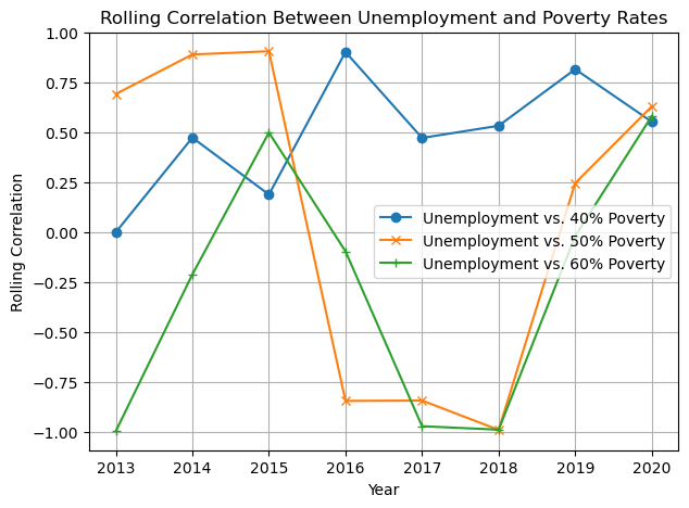
As can be seen from the figure, the 40% poverty rate line is relatively stable, implying that unemployment has a more consistent impact on this low poverty rate or that this indicator is relatively unaffected by other changes, such as policy changes. On the other hand, the 50% and 60% poverty rate lines show volatility, which may indicate that the relationship between the unemployment rate and these poverty rates has been significantly affected by other factors over time, possibly due to policy changes or other socio-economic factors.
This may indicate that policy or socio-economic interventions have more effectively alleviated the 50% and 60% poverty rates. In other words, these measures have not benefited households with the lowest poverty levels.
1
5.Conclusion
In summary, this analysis explores the correlation between long-term unemployment rates and various indicators to identify how changes in the economic environment affect individual well-being.
Worsening economic conditions affect people’s health, as shown by the fact that high levels of long-term unemployment increase the likelihood that the adult population will forgo treatment due to cost. In addition, negativity in the family can be transmitted to children, affecting their mental health. Another significant effect is that an economic downturn can push more children in society into poverty, especially those below the poverty level.
Therefore, solid support systems are needed to mitigate the negative impact of economic instability on the well-being of individuals, especially groups of children.
However, the influences on individual well-being are multifaceted. External interventions in different years may have significantly impacted these variables, which were not considered in this analysis. Further research and studies are necessary to validate these findings and explore more recent data to identify trends or causal relationships.
6.Key findings
- Long-term unemployment has a strong correlation with the suicide rate
- Long-term unemployment is not significantly related to children’s vegetable intake
- Economic stress can indirectly affect children via adults’ emotional well-being
- The worsening economy causes more families with children to fall below the poverty line
- Households at the lowest poverty levels rarely benefit from external measures